Power BI Data Analyst PL-300
Report Design, Visualizations, and Interactivity
Translating raw data into actionable insight is the ultimate purpose of Power BI, and the report layer is where that translation becomes visible to business stakeholders. Chapter 7 examines visual selection, filter propagation, navigation patterns, and accessibility — the highest-weighted domain cluster in the PL-300 examination. Mastering these capabilities requires understanding not only what each visual does, but when each is the correct architectural choice and how to configure its behavior predictably at enterprise scale.
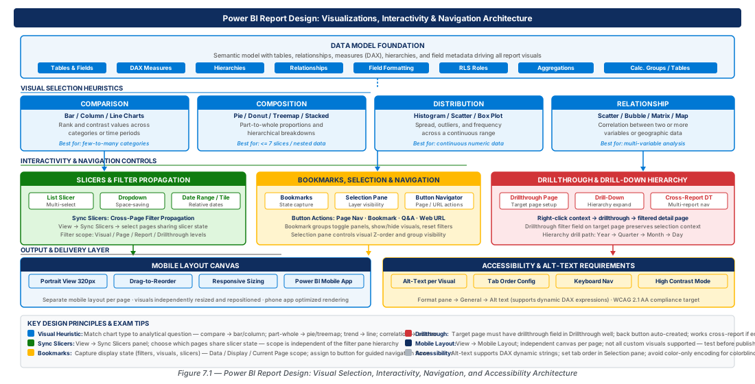
Visual Selection Foundations: The Four Communication Goals
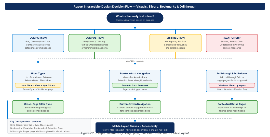
Every visualization in Power BI answers one of four fundamental analytical questions: How do values compare across categories? How does a whole decompose into its parts? How are values distributed across a continuous range? How do two quantitative variables relate to each other? The wrong chart for the right data is still the wrong chart, and the PL-300 exam tests this judgment extensively through scenario-based questions.
Comparison Visuals: Ranking and Change Over Time
Clustered bar and column charts are the canonical tools for ordinal comparison. Bar orientation is preferred when category labels are long; column orientation signals time on the horizontal axis. The line chart encodes trend as slope and is preferred for five or more time periods. The waterfall chart shows how a starting value reaches an ending value through sequential contributions — the correct choice for budget variance and period-over-period decomposition.
The ribbon chart enhances stacked area charts by showing rank changes through color-coded ribbons — powerful for analytical users but cognitively expensive for executive audiences. The bullet chart overlays actual performance against a target and a qualitative range, making it the densest single-axis comparison visual. When the PL-300 presents a scenario requiring KPI, target, and performance band in a compact space, the bullet chart pattern is the expected answer.
Tip
Time always belongs on the horizontal axis in a column chart. Non-temporal categories with labels longer than eight characters belong on the vertical axis in a bar chart to preserve readability without rotation.
Composition Visuals: Parts of a Whole
Pie and donut charts are the most recognizable but most misused composition visuals — limit them to three to five segments where differences are clearly visible. Stacked bar and column charts are more accurate because they use length rather than area, but only the baseline segment can be accurately compared across categories. The treemap excels for two-level hierarchies using nested rectangles; beyond 20–30 leaf nodes, prefer a matrix or decomposition tree.
Important
The PL-300 exam frequently tests whether candidates know that pie charts should not be used for more than five segments or when segments are close in value. Eight product categories with close values maps to a stacked bar or treemap, not a pie chart.
Distribution Visuals: Spread and Shape
Power BI lacks a native histogram; the closest approximation is a column chart on a DAX-calculated bin column, or a custom AppSource visual. The scatter chart is the most analytically powerful native distribution visual, plotting individual data points across X and Y axes to reveal clusters and outliers. Adding a play axis field converts the scatter chart into an animated bubble chart, allowing temporal exploration — a feature uniquely available in Power BI and specifically tested on the PL-300.
Relationship Visuals: Correlation and Network
The scatter chart serves double duty as a relationship visual when the question is "Does increased marketing spend predict higher sales?" — adding a trend line from the Analytics pane makes correlation explicit. The key influencers visual is Power BI's AI-powered relationship tool: given a target metric and explanatory dimensions, it automatically identifies the most strongly associated factors. Candidates must know it requires import-mode or DirectQuery (not live SSAS in some configurations), and that its output changes dynamically based on current selections.
| Visual Type | Primary Question | Best For | Avoid When |
|---|---|---|---|
| Column / Bar | How do values compare? | Up to 15 categories, time series | Too many categories (use matrix) |
| Line Chart | How has a value changed? | 5+ time periods, trend analysis | Discrete non-temporal categories |
| Pie / Donut | What is each segment's share? | 3–5 segments, clear majorities | Segments close in value or > 5 |
| Stacked Column | How does composition change over time? | Part-to-whole with temporal view | Individual segment comparison needed |
| Treemap | How do hierarchical parts relate to whole? | 2-level hierarchy, < 30 leaf nodes | Flat single-level data (use bar) |
| Scatter | How do two metrics relate? | Correlation, outlier detection | When one axis is categorical |
| Waterfall | How does a value change step by step? | Variance analysis, bridge charts | Non-sequential, non-additive data |
| Key Influencers | What factors drive a metric? | AI-assisted root cause analysis | Small datasets (< 1000 rows) |
| Decomposition Tree | What explains a composition? | Drill-down contribution analysis | When structure is pre-defined |
Slicers, Sync Slicers, and Cross-Page Filter Propagation
Slicers are the primary user-driven filter mechanism in Power BI reports, and their configuration — which pages they affect, how they interact, and how they persist across navigation — is heavily tested in the PL-300. Architecturally, slicers operate on visual-level, page-level, or report-level filter context, and "slicer sync" explicitly extends that context across page boundaries.
Slicer Types and Configuration
The list slicer displays all distinct values for low-cardinality dimensions. The dropdown slicer compresses the same list behind a collapsed control, preferred on mobile layouts. The relative date slicer is the most exam-relevant date variant, expressing filters like "Last 3 months" or "This year" relative to today — making reports self-refreshing without end-user date bound updates, which is architecturally critical for operational dashboards.
Native slicers do not support multi-level hierarchies. The workaround is either a custom hierarchy slicer from AppSource or multiple stacked single-field slicers. For the PL-300, knowing this limitation and the accepted workaround is the expected answer when a scenario describes multi-level temporal filtering.
Warning
Slicers set to "single select" with no default value selected return all data, which can mislead users who expect an empty slicer to mean "no data." Always configure a default selected value or "Select All" to avoid ambiguous slicer states.
Sync Slicers and Cross-Page Filter Architecture
The Sync Slicers pane (View > Sync Slicers) provides two independent checkboxes per page: Sync (propagates the filter to the page even if the slicer is not visible) and Visible (the slicer control appears on this page). A slicer that is synced but not visible enables a "master filter" pattern where filtering is set on a dedicated page but applies globally without cluttering other pages.
Tip
Use the "Group" feature in the Sync Slicers pane to give slicers a named sync group. This enables independent filter axes — e.g., a "Time Period" group and a "Geography" group — without cross-interference between groups.
Report-Level, Page, and Visual Filters
Power BI's filter hierarchy has three levels separate from slicers: report-level filters apply to every page and visual; page-level filters apply to all visuals on a single page; visual-level filters apply only to a specific visual. Report-level filters are invisible to end users by default and are the correct pattern for enforcing security-sensitive constraints like "Active = True" across all pages.
Cross-filter behavior between visuals is configured via Format > Edit Interactions and is page-scoped — configuration on Page 1 does not affect the same visual on Page 2. Cross-highlighting preserves total context while showing the selected segment proportionally; cross-filtering removes all non-selected rows. Cross-highlighting is preferred for executive dashboards where stakeholders need to see the selected segment in relation to the total.
Important
Cross-filter and cross-highlight interactions are page-scoped. Configuring Edit Interactions on Page 1 does not affect the same visuals on Page 2 — authors must configure interactions separately on every page.
Bookmarks, Selection Pane, and Button-Driven Navigation
Bookmarks capture the complete state of a report page — filter context, visual visibility, slicer selections, and scroll position — in a single named object. Button-driven navigation using bookmarks transforms a flat report into a navigable application. This pattern is extensively tested on the PL-300 as it represents the synthesis of interactivity, design, and data model knowledge.
Understanding Bookmark State
A bookmark captures five state dimensions: Data (filter and slicer selections), Display (visible/hidden state per the Selection Pane), Current page, All visuals vs. Selected visuals, and scroll position. Creating two bookmarks that differ only in Display state produces a toggle effect — the chart/table toggle is the most examined bookmark use case on the PL-300, implemented using "Selected visuals" capture to leave all other report state unchanged.
Tip
When creating a bookmark pair for a chart/table toggle, uncheck "Data" in bookmark options. Capturing Data forces users back to the filter state at bookmark creation time, destroying their current slicer selections — a common and costly design error.
The Selection Pane and Visibility Control
The Selection Pane (View > Selection) lists every visual object on the page with eye-icon visibility toggles. Hidden objects are not shown to consumers but remain in the file and can be made visible through bookmark application. The Selection Pane also controls Z-order — objects higher in the list appear in front. A transparent button placed on top of a visual intercepts clicks; a tooltip visual hidden by default becomes visible when a bookmark activates it.
Naming objects in the Selection Pane is an explicitly recommended best practice. Renaming from generic "Bar Chart 1" to "RevByRegion_BarChart" makes bookmark management unambiguous and is recognized in Microsoft's Power BI adoption framework as a professional standard the PL-300 exam expects candidates to know.
Note
Objects hidden in the Selection Pane still load and execute their DAX queries. Hiding a visual does not reduce its performance impact. For performance-critical reports, use page navigation to separate content rather than hiding expensive visuals behind bookmarks.
Button-Driven Page Navigation
Power BI buttons support an Action property triggering page navigation, bookmark application, Q&A, web URL, drillthrough, or back navigation. Dynamic page navigation — where the destination is determined by a text field from the data model — uses a disconnected navigation table, a slicer bound to that table, and a SELECTEDVALUE() measure as the page destination. This single button pattern can serve as a universal navigator across any number of pages.
// Dynamic Page Navigator Measure
NavigateToPage =
SELECTEDVALUE(
    NavigationTable[PageName],
    "Overview"  -- Default page if nothing selected
)Warning
The "Back" action navigates to the previously visited page, not a specific named page. In drillthrough, Back returns to the source page. Outside drillthrough, Back produces unpredictable behavior if users arrive via multiple paths — always test across all entry paths.
Drillthrough Pages and Drill-Down Hierarchy Configuration
Drillthrough and drill-down are architecturally distinct. Drill-down operates within a single visual, expanding a hierarchy level within the same chart space. Drillthrough navigates from one page to another, carrying filter context from a selected data point to a detail destination page. Both are heavily weighted on the PL-300 as the core mechanism for detail-on-demand reporting.
Configuring Drillthrough Pages
A page becomes a drillthrough target by placing at least one field into the Drillthrough field well in the Visualizations pane. Power BI automatically adds a Back button and makes the page available as a right-click drillthrough destination from any visual on any page that contains the drillthrough field. Drillthrough filters are applied as report-level filters, meaning they override page-scoped slicers on the target page unless "Keep all filters" is enabled.
The Keep all filters toggle controls whether source-page slicer selections carry through to the drillthrough target. Enable it for exploratory reports where the user's current slicer context should carry through; disable it when the drillthrough page must always show complete, unfiltered context for the selected entity.
Important
Drillthrough filters are applied as report-level filters on the target page. Slicers on that page retain their default values and do not automatically match the drillthrough context — design drillthrough pages to rely on the drillthrough filter, not user-selected slicers.
Drill-Down Hierarchy Configuration
For a visual to support drill-down, its axis, legend, or rows field well must contain a hierarchy — either a model hierarchy or multiple fields added to the same well. The drill-down control arrows in the visual header expose two modes: Drill down on a single member (filters the visual to the clicked member's children) and Go to next level (expands the entire visual to the next level without filtering). A scenario describing a user who wants "all months regardless of year" maps to "Go to next level," not single-member drill-down.
Tip
Use Power BI's auto date/time hierarchy (Year > Quarter > Month > Day) for drill-down rather than manually constructing hierarchies in DAX. Disable auto date/time only when a custom date dimension table with its own hierarchy is implemented.
Cross-Report Drillthrough
Power BI Premium and Premium Per User support cross-report drillthrough, extending the drillthrough pattern across report boundaries within the same workspace. This requires explicit enablement at both source and target report levels (File > Options > Report settings on the target), and both reports must share a common dataset connection. This feature is unavailable in Free or Pro licenses across different workspaces, and is tested on the PL-300 primarily as a licensing and configuration knowledge question.
Mobile Layout Canvas and Accessibility Requirements
Enterprise Power BI adoption increasingly includes mobile consumption, and the PL-300 explicitly covers mobile layout and accessibility as part of the "optimize reports for performance and usability" competency. These are not optional design considerations — they are tested exam objectives with specific configuration steps candidates must know.
Configuring the Mobile Layout Canvas
Power BI Desktop provides a dedicated Mobile Layout view (View > Mobile Layout) presenting a phone-sized portrait canvas. The desktop and mobile layouts are completely separate arrangements of the same visual objects — visuals on the mobile canvas are references, not copies, rendering with the same data and formatting at mobile dimensions. Visuals not added to the mobile layout are invisible in phone view; they are not hidden, they simply do not exist in that context.
Tip
Prioritize three to five critical KPIs on the mobile layout. Card visuals, KPI visuals, and a single trend line are the ideal mobile building blocks. Defer scatter charts and decomposition trees to desktop layouts only.
Accessibility Requirements and Alt-Text Configuration
Alt-text is configured through Format > General > Alt-text. The alt-text must describe the key insight, not just the visual type — "Bar chart" fails accessibility review; "Bar chart showing North America as highest revenue region at $4.2M for Q3 2025" meets WCAG 2.1 AA. Dynamic alt-text using a DAX measure is supported and is the enterprise-grade approach, updating automatically as filter context changes.
// Dynamic Alt-Text Measure for Revenue Bar Chart
AltText_RevByRegion =
"Bar chart showing regional revenue for " &
FORMAT(SELECTEDVALUE(DateTable[Year], "all years"), "General") &
". Top region: " &
TOPN(1, VALUES(Geography[Region]), [Total Revenue], DESC) &
" at " & FORMAT([Total Revenue], "$#,##0") & "."
Keyboard navigation tab order is controlled by the top-to-bottom ordering in the Selection Pane — reorder items so focus moves logically (filters before visuals, navigation buttons in reading order). Color contrast must meet WCAG 2.1 AA: 4.5:1 ratio for normal text and 3:1 for large text. Never rely solely on color to distinguish data series — add data labels, shapes, or patterns as secondary encodings (WCAG criterion 1.4.1).
Warning
Relying solely on color to convey information violates WCAG 2.1 criterion 1.4.1. A line chart where four product lines are distinguished only by color fails accessibility review for users with color vision deficiency. Add data labels or distinct shapes as secondary encodings.
Lab
These two cloud engineering labs provision the Azure infrastructure and Power BI workspace required to build and publish the multi-page report with sync slicers, drillthrough pages, and accessibility configuration demonstrated in this chapter.
CE-13: Deploy Azure Infrastructure for Multi-Page Report
Provisions the resource groups, ADLS Gen2 storage, Azure Key Vault for dataset credentials, and Synapse Analytics workspace that supply source data for the report. Run the complete script in Azure Cloud Shell with Contributor access on the target subscription.
# CE-13: Provision report design infrastructure
RG_PROD="rg-report-design-visualizations-prod-001"
LOCATION="eastus2"
STORAGE_PROD="reportdesignprodeastus2001"
KEY_VAULT="kv-reportdesign-prod-001"
az group create --name "$RG_PROD" --location "$LOCATION"
az keyvault create --name "$KEY_VAULT" --resource-group "$RG_PROD" \
  --location "$LOCATION" --enable-soft-delete true --enable-purge-protection true
az storage account create --name "$STORAGE_PROD" --resource-group "$RG_PROD" \
  --location "$LOCATION" --sku Standard_ZRS --enable-hierarchical-namespace true
# ... full script: see chapter repository CE-13 sourceCE-14: Publish Report and Configure Workspace via Power BI REST API
Uses the Power BI REST API to create a workspace, publish the PBIX file, configure dataset refresh schedule, and bind AAD security groups to RLS roles. Requires the service principal client ID and secret to be pre-stored in the Key Vault created in CE-13.
# CE-14: Publish report via Power BI REST API
PBI_API="https://api.powerbi.com/v1.0/myorg"
TENANT_ID=$(az account show --query tenantId -o tsv)
PBI_TOKEN=$(curl -s -X POST \
  "https://login.microsoftonline.com/$TENANT_ID/oauth2/v2.0/token" \
  -d "grant_type=client_credentials&client_id=$CLIENT_ID&..." \
  | jq -r '.access_token')
curl -s -X POST "$PBI_API/groups" \
  -H "Authorization: Bearer $PBI_TOKEN" \
  -d "{\"name\": \"ws-reportdesign-analytics-prod-001\"}"
# ... full script: see chapter repository CE-14 source
Summary
| Concept | Key Point |
|---|---|
| Visual Selection Heuristics | Match the visual to the analytical question: comparison (bar/line), composition (donut/treemap), distribution (scatter/histogram), relationship (scatter/key influencers). Never use pie charts for more than 5 segments. |
| Slicer Types | List slicers for categories, relative date slicers for self-maintaining temporal filtering. Native slicers do not support multi-level hierarchies without custom visuals. |
| Sync Slicers | Independent Sync and Visible toggles per page. A slicer can propagate filter context to a page (Sync) without being displayed there (Visible unchecked), enabling master-filter patterns. |
| Bookmarks | Capture Data, Display, and Page state. Uncheck Data for navigation bookmarks. Use Selected visuals capture for chart/table toggles without affecting other report state. |
| Button Navigation | Page Navigation action supports dynamic destination via SELECTEDVALUE() measure. Back buttons navigate to drillthrough source — test across all entry paths. |
| Drillthrough Configuration | Drillthrough field well designates target page. Keep All Filters controls whether source slicers carry through. Cross-report drillthrough requires Premium license and explicit enablement in both reports. |
| Mobile Layout | Separate canvas arrangement of the same visual objects. Visuals not added are invisible in phone view. Prioritize 3–5 KPI visuals; defer complex analytical visuals to desktop. |
| Accessibility Requirements | Alt-text must describe the key insight. Dynamic DAX alt-text updates with filter context. Keyboard tab order set in Selection Pane. Color alone must not be the only information channel (WCAG 1.4.1). |
Chapter: 7 of 12 | Status: v0.1 Draft |